Until now, most of the data in this course has been one variable at a time, or categories in a two-way table. This unit is about two quantitative variables measured on the same individuals: hours of sleep and reaction time, outdoor temperature and gas use, a car's age and its price. The first tool is a picture, and it comes before any formula.
Making a scatterplot
A scatterplot shows each individual as one point. Its horizontal position is the value of one variable and its vertical position the value of the other.
- Put the explanatory variable, the one you think helps explain or predict the other, on the horizontal axis ().
- Put the response variable, the outcome, on the vertical axis ().
- Label both axes with the variable and its units, and choose scales that fit the data, which need not start at 0.
If neither variable explains the other (height and arm span, say), either can go on either axis. But when there is a natural explanatory variable, it goes across.
Four things to describe
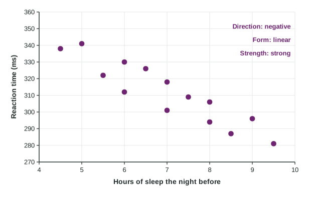
Look at the scatterplot and describe four features:
| Feature | Question to ask | Sleep and reaction time |
|---|---|---|
| Direction | As increases, does tend to increase (positive) or decrease (negative)? | negative: more sleep, shorter times |
| Form | Do the points follow a straight line (linear) or a bend (curved)? | linear |
| Strength | How closely do the points follow that form? | strong: little scatter around the trend |
| Unusual features | Are there outliers (points far from the pattern) or separate clusters? | none |
Worked example 1. Describe the relationship between hours of sleep and reaction time.
There is a strong, negative, linear association between hours of sleep the night before and reaction time for these 14 students, with no clear outliers. Students who slept more tended to react faster: reaction times fall from about 340 milliseconds after 4.5 to 5 hours of sleep to about 290 milliseconds after 9 to 9.5 hours.
Notice the habits: every feature is named, the variables are named in context with units, and a few values from the graph make the description concrete.
Strength is not steepness
A common slip is to call a steep trend "strong". Steepness tells you how much changes for each unit of ; strength tells you how tightly the points hug the pattern. A gently rising trend with points packed close is stronger than a steep trend with points scattered widely. Strength also does not depend on form: a curved pattern can be very strong.
Curves and outliers
Worked example 2. A dealer plots the age and price of 16 used cars of one model. Prices fall from about 31 thousand dollars for 1-year-old cars to about 20 thousand at 4 years, but only from about 13.7 to 12.2 thousand between 8 and 11 years.
There is a strong, negative, curved association between age and price for these cars: price drops quickly in the first few years and then levels off. There are no clear outliers.
An outlier in a scatterplot is a point that falls far from the overall pattern. It need not be extreme on either variable alone. On a homeowner's plot of temperature against gas use, one day at 20 degrees used only 2.1 therms while other days that cold used about 8. Its values are ordinary; the combination is not. When you see such a point, look for a reason (the family was away and turned the heat down) and report it rather than deleting it quietly.
Association is not causation
A scatterplot of observational data shows that two variables move together. It does not show that one causes the other. Students who sleep more might also eat breakfast, or be less stressed, and those could affect reaction time too. Sometimes a cause is believable for other reasons (cold weather clearly drives heating), but the plot alone does not prove it. Only a randomized experiment can support a cause-and-effect conclusion.
The next topic puts a number on the direction and strength of a linear association, so that "strong" and "weak" can be compared from one plot to another.