Unit 1 looked at one variable at a time. Most interesting questions involve two: are seniors more likely to drive to school than sophomores? Do older adults use the library more? When both variables are categorical, the tools are a two-way table, percents within each group, and a bar chart built from those percents.
The two-way table
A school surveys a random sample of 300 students and records two categorical variables for each: class year (sophomore or senior) and main way to school (bus, car, or walk or bike). A two-way table counts the students in each pairing of categories. One variable labels the rows, the other the columns, and the totals sit on the edges.
| Class year | Bus | Car | Walk or bike | Total |
|---|---|---|---|---|
| Sophomores | 72 | 48 | 40 | 160 |
| Seniors | 28 | 84 | 28 | 140 |
| Total | 100 | 132 | 68 | 300 |
Read a cell by its row and column: 84 students are seniors who come by car. The row totals say how big each group is (160 sophomores, 140 seniors). The column totals describe the whole sample (132 of the 300 come by car). The grand total, 300, is in the corner.
Compare groups with percents, not counts
It is tempting to say "84 seniors come by car but only 48 sophomores do, so seniors drive more." That comparison is unfair, because the groups are different sizes. If there were 1,000 sophomores, their counts would be bigger in every column. The fix is to turn each row into percents of its own total.
Worked example 1. Find the percent of each class year that uses each way to school.
Sophomores: bus , car , walk or bike . These add to 1, or 100%.
Seniors: bus , car , walk or bike . These also add to 100%.
Now the groups are on the same scale: 60% of seniors come by car, compared with 30% of sophomores.
Notice which total you divide by. "What percent of sophomores walk?" starts from the sophomores, so it divides by 160. "What percent of walkers are sophomores?" starts from the walkers, so it divides by 68: . The first words of the question tell you the group, and the group's total goes on the bottom.
Pictures of two categorical variables
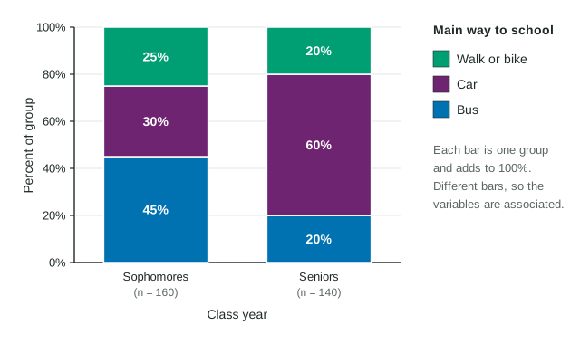
A segmented bar chart draws one bar for each group. Every bar has the same height, 100%, and is cut into pieces, one for each category of the other variable. The figure shows the commute data: the car segment is twice as tall for seniors as for sophomores, and the bus segment is much shorter.
Two other displays carry the same information:
- A side-by-side bar chart puts the percents as separate bars, grouped by class year, so you compare heights next to each other.
- A mosaic plot is a segmented bar chart in which each bar's width shows how big the group is. Wide bar, big group. The heights inside a bar are still percents of that group.
| Display | Bars show | Group size shown? |
|---|---|---|
| Segmented bar chart | each group's percents, stacked to 100% | no (write n under each bar) |
| Side-by-side bar chart | each group's percents, as separate bars | no |
| Mosaic plot | each group's percents, stacked to 100% | yes, by bar width |
Association
Two categorical variables are associated when knowing one changes the picture of the other: the percents differ from group to group. In the commute data they clearly do (45% against 20% for the bus, 30% against 60% for the car), so class year and way to school are associated in this sample. If every bar split at the same heights, there would be no association: knowing the class year would tell you nothing new about how a student gets to school.
Worked example 2. In a random sample of 250 adults, 48 of the 120 who exercise weekly usually sleep 8 hours, compared with 26 of the 130 who do not. Describe the association.
Percents: and .
In this sample, exercising weekly and sleeping 8 hours are associated: 40% of the adults who exercise weekly (48 of 120) usually sleep 8 hours, compared with 20% of the adults who do not (26 of 130).
A full description names the groups, says which has the higher percent, and gives the numbers, all in context.
Association is not cause
A survey only observes. If students who use a planner turn in more homework on time, it may be that organized students do both. That hidden variable is a confounding variable, from Unit 1. Only a randomized experiment can show that one variable causes a change in another. And because the commute and library samples were random, their associations can be generalized to the school and the town they came from.