A graph of a quantitative variable shows a distribution. Describing it in words is one of the most tested skills on the AP® Statistics exam, and one where students lose points for small omissions. The rule is short: give the shape, the center, the spread and any unusual features, with numbers, in context.
Shape
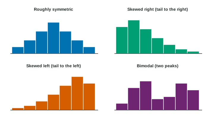
- Symmetric: the left and right sides are rough mirror images. Real data are never perfectly symmetric, so say "roughly symmetric".
- Skewed right: a long tail stretches toward the larger values. Incomes, commute times and house prices are often skewed right: most values are modest and a few are very large.
- Skewed left: a long tail stretches toward the smaller values. Scores on an easy test are often skewed left: most students score high and a few score much lower.
- Unimodal: one peak. Bimodal: two clear peaks, which often signals two different groups mixed together.
- Uniform: values occur about equally often, so the bars are about level.
The most common mistake is the direction of skew. Skew is named for the tail, not for where most of the data are. If the bulk of the data is on the left and the tail runs right, the distribution is skewed right.
Center and spread
The center is a typical value, roughly the value with half the data below it. Topic 1.7 gives exact measures; for now, estimate it from the graph by counting values from the left until you reach half of them.
The spread (variability) is how far apart the values are. Give it with numbers: "most commutes take between 5 and 30 minutes", or "the heights run from 148 to 202 cm". A distribution whose values lie close together has little variability; one whose values are far apart has a lot.
Unusual features
- An outlier is a value that falls far from the overall pattern. Investigate it: it may be a recording error, or a real and interesting case. Do not delete it just because it is unusual. Topic 1.7 gives a rule for deciding what counts as an outlier.
- A gap is a stretch with no values. A cluster is a bunch of values set apart from the rest by gaps.
Putting it into words
Describe a distribution. A histogram shows the one-way commute times of 60 hospital workers in bins 5 minutes wide. The bin counts, from 0 to 5 minutes onward, are 3, 10, 14, 11, 8, 6, 4, 2, 1, then four empty bins, then 1 commute between 65 and 70 minutes.
Shape: the bars rise to a peak at 10 to 15 minutes and trail off to the right, so the shape is skewed right and unimodal.
Center: counting from the left, commutes are under 15 minutes and are under 20. Half of 60 is 30, so the middle of the data lies between 15 and 20 minutes.
Spread: most commutes take from about 5 to 30 minutes, and the main group runs up to 45 minutes.
Unusual features: a gap from 45 to 65 minutes, then one commute between 65 and 70 minutes, a possible outlier.
In context: "The distribution of commute times for these 60 workers is skewed right, with a center between 15 and 20 minutes. Most commutes take from 5 to 30 minutes. There is a gap from 45 to 65 minutes and one possible outlier between 65 and 70 minutes."
Two peaks: describe the groups
Heights of 30 athletes at a sports camp form two clusters, one from about 148 to 164 cm and one from about 184 to 202 cm, with no one between 165 and 180 cm. The distribution is bimodal. A single "typical height" of about 175 cm would describe nobody. When a distribution is bimodal, look for a reason (here, gymnasts and basketball players in one data set) and describe each group on its own.
Checklist
| Feature | What to write | Common slip |
|---|---|---|
| Shape | skewed right or left, roughly symmetric, unimodal, bimodal, uniform | naming the skew for the bulk instead of the tail |
| Center | a typical value, with a number | no number |
| Spread | how far the values reach or vary, with numbers | no number, or no spread at all |
| Unusual features | outliers, gaps, clusters, with values | leaving them out |
| Context | the variable and its units | "the data" or "it" with no variable named |