Categorical data get bars. Quantitative data get a number line, because their values have positions: 3 books is between 2 and 4. This page covers the four graphs for one quantitative variable: dotplots, stemplots, histograms and cumulative relative frequency graphs.
Dotplots
A dotplot draws a number line and puts one dot above it for each value. When a value repeats, the dots stack. A dotplot of how many books 25 students read over the summer shows every student at once: one at 0, two at 1, four at 2, five at 3, and so on up to one student at 12.
Dotplots are ideal for small data sets. With hundreds of values the stacks become towers, and another display works better.
Stemplots
A stemplot (stem-and-leaf plot) splits each value into a stem, its leading digits, and a leaf, its last digit. The stems go down the left in order; each value’s leaf goes on its stem’s row. Always include a key.
Build and read a stemplot. Twenty chemistry test scores: 58, 62, 65, 67, 71, 72, 74, 75, 77, 78, 80, 81, 83, 84, 84, 86, 88, 90, 93, 97.
| Stem | Leaves |
|---|---|
| 5 | 8 |
| 6 | 2 5 7 |
| 7 | 1 2 4 5 7 8 |
| 8 | 0 1 3 4 4 6 8 |
| 9 | 0 3 7 |
Key: 7 | 4 stands for 74 points. The lowest score is 58; seven students scored in the 80s; the two 4 leaves on the 8 stem are two students with 84. Scores of 90 or above: 3 of 20, so .
A stemplot keeps every value, which a histogram does not. Turned on its side, its rows look like the bars of a histogram with bins of 10.
Histograms and bin width
A histogram splits the number line into equal-width bins, counts the values in each bin, and draws a bar for each count (or relative frequency). The bars touch, because the bins cover the number line with no breaks. Each value goes in exactly one bin: the usual rule is that a bin holds its left end but not its right end, so with bins 2 to 4 and 4 to 6, the value 4 goes in the 4 to 6 bin.
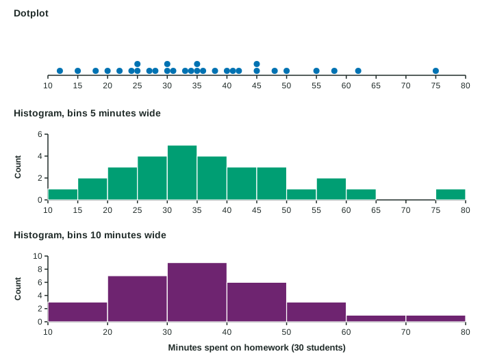
The person drawing a histogram chooses the bin width, and the choice changes the picture. Narrow bins show more detail but also more random bumps. Wide bins give a smoother picture but can hide features such as a gap. A sensible histogram usually has somewhere between 5 and 20 bins. When you read a histogram, remember that you see only bin counts: the exact values are gone.
A histogram of relative frequencies looks exactly like the histogram of counts; only the numbers on the vertical axis change, because every count is divided by the same total.
Cumulative relative frequency graphs
A cumulative relative frequency graph adds the relative frequencies from the left. At each value it shows the proportion of the data at or below that value, so it rises from 0 to 1.
Read proportions from a cumulative graph. For 200 workers’ commute times the graph passes through (10, 0.15), (20, 0.45), (30, 0.70), (40, 0.85), (50, 0.95) and (60, 1).
20 minutes or less: read the height at 20, which is 0.45.
More than 30 minutes: .
More than 20 and up to 40 minutes: subtract heights, , so 40% of the workers, or workers.
Half the workers commute this long or less: the graph crosses 0.50 between 20 and 30 minutes.
Choosing a display
| Display | Keeps every value? | Best for |
|---|---|---|
| Dotplot | yes | small data sets, about 50 values or fewer |
| Stemplot | yes | small data sets, when you want the actual values |
| Histogram | no, only bin counts | large data sets |
| Cumulative graph | no | reading the proportion at or below a value |
Whatever the display, label the axis with the variable and its units. The next topic uses these graphs to describe what a distribution looks like.