Topic 1.7 gave you quartiles, the median and a rule for outliers. A boxplot turns those numbers into a picture. It is quick to draw, easy to compare across groups, and it shows skew and outliers clearly. It also hides a lot, and knowing what it hides is part of reading it well.
The five-number summary
The five-number summary is the minimum, , the median, and the maximum. These five numbers cut the ordered data into four parts with about a quarter of the values in each: below , from to the median, from the median to , and above .
Find the five numbers. Seven values in order: 3, 5, 7, 8, 12, 13, 14.
Median: the 4th value, 8.
With n odd, leave the median out of both halves. Lower half 3, 5, 7: . Upper half 12, 13, 14: .
Five-number summary: 3, 5, 8, 13, 14.
Drawing a boxplot
- Draw a number line for the variable, with units.
- Draw a box from to and a line across it at the median.
- Compute the fences, and . Do not draw them; use them to sort the values.
- Draw each whisker from the box out to the most extreme data value inside its fence.
- Mark every value beyond a fence as a separate point: these are the outliers.
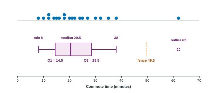
Build the boxplot. The commute times of 20 workers, in minutes: 8, 10, 12, 12, 14, 15, 16, 18, 18, 20, 21, 22, 24, 25, 27, 30, 32, 35, 38, 62.
Median: average of the 10th and 11th values, .
: the lower 10 values have median . : the upper 10 have median .
. Fences: and .
62 is above 49.5, so it is an outlier. The right whisker stops at 38, the largest value inside the fence; the left whisker reaches the minimum, 8.
Reading a boxplot
- Center: the median line. It is the median, not the mean; a boxplot does not show the mean.
- Spread: the length of the box is the IQR; from the end of one whisker (or the farthest outlier) to the other is the range.
- Quarters: about 25% of the values lie in each whisker section and in each half of the box. So "about half the workers commute between 14.5 and 28.5 minutes", and "about a quarter commute longer than 28.5 minutes".
- Skew: a longer whisker on one side and the median closer to the other end of the box suggest skew toward the long side. Above, the right whisker and the outlier stretch far to the right: skewed right.
- Outliers: points beyond the whiskers, by the rule.
A longer section does not hold more values. Each quarter holds about the same number of values; a longer section means those values are more spread out.
What a boxplot cannot show
Everything inside the box and along the whiskers is hidden. Two very different data sets can have the same boxplot: one with values spread evenly, another with two clumps and a gap. So a boxplot cannot show how many peaks a distribution has, or gaps and clusters. Saying a boxplot is "unimodal" or "bell-shaped" is a classic exam error. If you need the shape in detail, use a dotplot or a histogram; if you need to compare groups quickly, the boxplot is the tool of choice.
| A boxplot shows | A boxplot hides |
|---|---|
| median, quartiles, minimum and maximum | the mean and standard deviation |
| IQR and range | how many values there are |
| skew, roughly | peaks, gaps and clusters |
| outliers by the rule | individual values inside the fences |