Graphical Representations of Summary Statistics for One Quantitative Variable
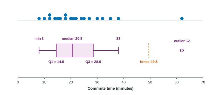
A boxplot pictures the five-number summary: a box from Q_1 to Q_3 split at the median, whiskers to the most extreme values inside the 1.5×IQR fences, and outliers marked separately.
Part 1 · Hook
Why this matters
Part 2 · Before you start
What this builds on
Part 3 · Prerequisite check
Quick check before you start
1. For 6, 9, 11, 12, 13, 14 what is the median?
- 11.5
- 11
- 12
- 10.83
Show the answer
n = 6 is even: average the 3rd and 4th values, (11 + 12)/2.
- Correct: 11.5:
- 11:
- 12:
- 10.83:
2. With and , what is the upper fence?
- 19
- 16
- 14
- 25
Show the answer
, so .
- Correct: 19:
- 16:
- 14:
- 25:
Part 4 · See it
See it first
Part 5 · Step by step
How it works, step by step
- Find the minimum, , the median, and the maximumthese five numbers split the ordered data into four quarters
- Draw a box from to with a line at the medianthe box holds the middle half of the data, and its length is the IQR
- Compute the fences and values beyond them are marked as outliers, and each whisker stops at the most extreme value inside its fence
- The picture keeps only quarters and outliersit shows center, spread and skew, but it cannot show peaks, gaps or the mean
Part 6 · Key ideas
Key ideas
- The five-number summary is minimum, , median, , maximum. Each quarter of the data lies between two neighbors.
- A boxplot draws a box from to with a line at the median, whiskers to the most extreme values inside the fences, and outliers as separate points.
- Skew shows as a longer whisker and a median closer to one end of the box: skewed right when the right side is stretched.
- A boxplot cannot show modality, gaps or clusters, so never describe a boxplot as having one or two peaks.
Part 7 · Misconception
A common mistake
The wrong idea: The right whisker always goes to the maximum value.
What actually happens: A whisker stops at the most extreme value inside the fence. If the maximum is beyond , it is plotted as an outlier and the whisker is shorter.
Part 8 · Check yourself
Check yourself
Exam-style questions. Anything you miss goes into your review queue.
Graph
Commute times of 20 nurses
1. What is the first quartile, , of the commute times, in minutes?
Type a number, in minutes. A table answer and a calculator answer are both accepted.
Show the answer
Lower half: the 10 smallest values, 6 to 19. Its median is minutes.
- Answer: 13.5 minutes
2. What is the upper fence, , in minutes?
Type a number, in minutes. A table answer and a calculator answer are both accepted.
Show the answer
, , so the fence is minutes.
- Answer: 47.25 minutes
3. Why does the right whisker end at 37 minutes and not at the maximum, 58?
- Whiskers stop at plus the IQR, which is about 40.5
- 58 is beyond the upper fence, so it is drawn as an outlier
- The whisker is drawn to the same length as the left whisker
- 37 is the 95th percentile of the 20 commute times
Show the answer
Whiskers go to the most extreme values that are not outliers. Outliers, beyond the fences, are marked separately.
- Whiskers stop at plus the IQR, which is about 40.5: The whisker stops at an actual data value, the largest one inside the fence.
- Correct: 58 is beyond the upper fence, so it is drawn as an outlier: Right: a whisker reaches the most extreme value inside the fences, here 37; 58 is above 47.25.
- The whisker is drawn to the same length as the left whisker: Whiskers can have different lengths; that is how a boxplot shows skew.
- 37 is the 95th percentile of the 20 commute times: Whiskers are not set at a percentile; they end at the most extreme value inside the fences.
4. About what percent of the nurses have commutes longer than , 27 minutes?
- About 75%
- About 50%
- About 5%
- About 25%
Show the answer
The five numbers split the data into quarters: about 25% of the values lie above . Here 5 of 20 nurses do.
- About 75%: About 75% are at or below ; the part above is a quarter.
- About 50%: The box holds the middle half; the upper whisker and outliers hold about a quarter.
- About 5%: The outlier is one of five values above 27 minutes.
- Correct: About 25%: Right: has about three quarters of the data at or below it, so about a quarter above.
5. A student says, "The boxplot shows that the commute times have one peak." What is wrong with this claim?
- A boxplot shows five numbers and outliers, so it cannot show peaks
- The boxplot shows two peaks, one on each side of the median
- Commute times are categorical, so they have no peaks
- The peak of a boxplot is the outlier at 58 minutes
Show the answer
Never read modality (one peak, two peaks) from a boxplot. Use a dotplot or histogram for shape details.
- Correct: A boxplot shows five numbers and outliers, so it cannot show peaks: Right: a boxplot hides how values are spread inside the box and whiskers, so it cannot show modality, gaps or clusters.
- The boxplot shows two peaks, one on each side of the median: A boxplot shows no peaks at all; the halves of the box are quarters of the data, not peaks.
- Commute times are categorical, so they have no peaks: Commute times are quantitative. The issue is what a boxplot can show.
- The peak of a boxplot is the outlier at 58 minutes: An outlier is a single far value, not a peak.
6. What is the five-number summary of 3, 5, 7, 8, 12, 13, 14?
- 3, 6, 8, 12.5, 14
- 3, 5, 8, 13, 14
- 3, 5, 8.86, 13, 14
- 3, 7, 8, 12, 14
Show the answer
Min 3; = median of 3, 5, 7 = 5; median 8; = median of 12, 13, 14 = 13; max 14.
- 3, 6, 8, 12.5, 14: That keeps the median, 8, in both halves. With n odd, leave it out: lower half 3, 5, 7.
- Correct: 3, 5, 8, 13, 14: Right: median 8; the lower half 3, 5, 7 has median 5; the upper half 12, 13, 14 has median 13.
- 3, 5, 8.86, 13, 14: 8.86 is the mean. The five-number summary uses the median, 8.
- 3, 7, 8, 12, 14: The quartiles are the medians of each half, not the neighbors of the median.
7. In a boxplot, the median is close to and the right whisker is much longer than the left. What is the most likely shape?
- Skewed left
- Skewed right
- Roughly symmetric
- Bimodal
Show the answer
Long right whisker and the median near : the upper values are spread out, so the distribution is skewed right.
- Skewed left: A median near means the lower values are bunched, and the upper values stretch out to the right.
- Correct: Skewed right: Right: the upper half of the data stretches farther, a long tail toward the larger values.
- Roughly symmetric: Symmetry would show a median near the middle of the box and whiskers of similar length.
- Bimodal: A boxplot cannot show peaks.
Part 9 · Summary
Summary
Part 10 · Up next
What comes next
Part 11 · Connections