A scatterplot shows the direction, form and strength of a relationship, but "strong" and "fairly strong" are hard to compare from one plot to the next. For a linear pattern, one number does the job: the correlation, written .
What tells you
- The sign gives the direction: for a positive association, for a negative one.
- The size gives the strength of the linear pattern: near 1 or when points hug a line, near 0 when there is no linear pattern.
- is always between and 1. It equals 1 or only when every point lies exactly on a line.
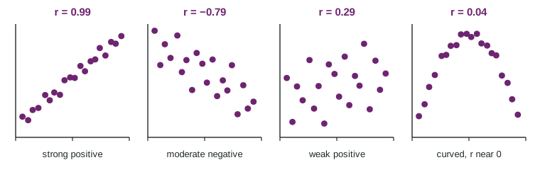
The figure shows four data sets. Rough guide: a size above about 0.8 is strong, 0.5 to 0.8 moderate, below 0.5 weak. But look at the fourth plot: the points follow an arch almost perfectly, yet . Correlation measures how well a line fits, nothing else.
Where the number comes from
The formula uses z-scores, which you met with one variable. Standardize each and each , multiply each pair, and average the products (dividing by , as for a standard deviation):
Why does this work? Draw lines at and . A point above average on both variables has two positive z-scores, so a positive product; a point below average on both has two negative z-scores, again a positive product. Points in the other two corners give negative products. If most points sit in the upper right and lower left, the products add up to a positive .
Worked example. Find for the four points , , , .
Means and standard deviations: , ; , .
z-scores:
Products: , , , , which add to .
In practice, use technology: a linear regression or correlation command on the two lists reports directly. The formula is for understanding, not for long hand calculations.
Interpreting in context
For the teacher's 8 students, technology gives between hours studied and quiz score. Write it like this: "There is a strong, positive, linear association between hours studied and quiz score for these students." Do not write "95% of students ..." or "scores rise 0.95 points per hour". is not a percent and has no units.
Properties to remember
| Property | Why |
|---|---|
| No units; changing units (hours to minutes) leaves the same | z-scores have no units |
| Switching and leaves the same | the formula treats the variables alike |
| Not resistant: one outlier can change a lot | a far-off point has large z-scores |
| Measures linear association only | a symmetric curve gives products that cancel |
To see the outlier effect: add a ninth student who studied 6 hours but scored 40, and falls from 0.95 to about 0.14.
Correlation is not causation
A strong correlation in observational data does not mean one variable causes the other. Across cities, the number of fire trucks sent to a fire is strongly correlated with the damage, because bigger fires bring more trucks and do more damage. A third variable linked to both, here the size of the fire, can create a correlation. Only a randomized experiment supports a claim of cause.