Graphical Representations for One Categorical Variable
Bar charts and pie charts display one categorical variable.
Part 1 · Hook
Why this matters
Part 2 · Before you start
What this builds on
Part 3 · Prerequisite check
Quick check before you start
1. In a sample of 200, the relative frequency of a category is 0.15. What is its count?
- 30
- 15
- 0.15
- 1,333
Show the answer
Count = relative frequency × total = 0.15 × 200 = 30.
- Correct: 30:
- 15:
- 0.15:
- 1,333:
2. When do the relative frequencies of a categorical variable add to 1?
- When each individual is in exactly one category
- Always, whatever the survey asked
- Only when there are two categories
- When the sample is large
Show the answer
Then the categories together make up the whole sample.
- Correct: When each individual is in exactly one category:
- Always, whatever the survey asked:
- Only when there are two categories:
- When the sample is large:
Part 4 · See it
See it first
Part 5 · Step by step
How it works, step by step
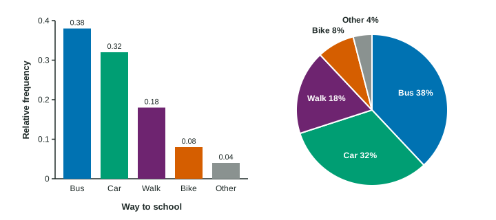
- Each category of a categorical variable gets one barthe bar’s height is the category’s count or relative frequency, measured from 0
- Categories have no number orderbars can go in any order and are drawn with gaps between them
- When each individual is in exactly one categorythe parts make one whole, so a pie chart can show them as slices
- A cut-off axis or bars from groups of different sizesthe picture misleads, so start at 0 and graph relative frequencies to compare groups
Part 6 · Key ideas
Key ideas
- A bar chart shows one bar per category, with height equal to the count or relative frequency. The vertical axis starts at 0.
- A pie chart shows each category as a slice of one circle, sized by its relative frequency. It needs categories that do not overlap and cover everyone.
- Bar charts make it easier to compare categories; pie charts show how parts make up a whole.
- To compare groups of different sizes, graph relative frequencies, and describe what the graph shows with numbers, in context.
Part 7 · Misconception
A common mistake
The wrong idea: School B’s bar is four times as tall, so its pass rate is four times school A’s.
What actually happens: The axis starts at 50%. The actual rates are 58% and 52%, a difference of 6 percentage points.
Part 8 · Check yourself
Check yourself
Exam-style questions. Anything you miss goes into your review queue.
Graph
Favorite kind of film
1. Which kind of film did 15% of the teens choose?
- Horror
- Drama
- Other
- Action
Show the answer
Read the height of each bar on the relative frequency axis: drama is at 0.15.
- Horror: The horror bar reaches 0.12, so 12% chose horror.
- Correct: Drama: Right: the drama bar reaches 0.15, which is 15%.
- Other: The other bar reaches 0.10, so 10% chose another kind.
- Action: The action bar reaches 0.25, so 25% chose action.
2. How many of the 200 teens chose action films?
- 25
- 60
- 800
- 50
Show the answer
Count = relative frequency × total = .
- 25: The bar shows a relative frequency, 0.25. Multiply by the total, 200.
- 60: That is comedy: 0.30 × 200 = 60.
- 800: A count from a relative frequency is a multiplication: 0.25 × 200.
- Correct: 50: Right: teens.
3. Which claim does the bar chart support?
- Comedy was chosen about twice as often as drama
- Most teens chose comedy
- Action films are better liked than drama films by each teen
- More teens chose horror than chose documentaries and other together
Show the answer
Compare bar heights: comedy at 0.30 is twice drama at 0.15. "Most" would need more than 0.50.
- Correct: Comedy was chosen about twice as often as drama: Right: 0.30 is twice 0.15.
- Most teens chose comedy: Comedy is the most common choice, but 0.30 is less than half, so not most.
- Action films are better liked than drama films by each teen: The chart shows how many teens chose each kind as a favorite, not each teen’s ranking of all kinds.
- More teens chose horror than chose documentaries and other together: Horror is 0.12, and documentaries plus other is 0.08 + 0.10 = 0.18.
4. Could these data also be shown in a pie chart?
- No: a pie chart can show four categories or fewer
- No: pie charts are used for counts, and these are relative frequencies
- Yes: each teen chose one kind, so the six parts add to 1
- Yes, but just after the bars are sorted from tallest to shortest
Show the answer
A pie chart works when every individual is in exactly one category, so the parts add to the whole. Here they add to 1.
- No: a pie chart can show four categories or fewer: A pie chart can have many slices; what it needs is parts that make up one whole.
- No: pie charts are used for counts, and these are relative frequencies: A pie chart shows each category as a part of the whole, which is exactly a relative frequency.
- Correct: Yes: each teen chose one kind, so the six parts add to 1: Right: 0.30 + 0.25 + 0.15 + 0.12 + 0.08 + 0.10 = 1, so the slices make one whole.
- Yes, but just after the bars are sorted from tallest to shortest: Sorting is a design choice; the parts already make up one whole.
Diagram
A bar chart from a school report
A report shows the percent of students who passed a state exam at two schools: 52% at school A and 58% at school B. Its bar chart is below.
5. Why does this bar chart give a misleading picture?
- It uses different colors for the two schools’ bars
- It shows percents instead of numbers of students passing
- Its vertical axis starts at 50%, not at 0%
- It puts A on the left
Show the answer
A bar’s height (or length) must be its value, measured from 0. Starting the axis at 50% exaggerates the difference.
- It uses different colors for the two schools’ bars: Colors help tell the bars apart; they do not change the heights.
- It shows percents instead of numbers of students passing: Percents are the right choice for schools of different sizes.
- Correct: Its vertical axis starts at 50%, not at 0%: Right: with the bottom cut off, bar heights no longer match the values they stand for.
- It puts A on the left: The order of categories in a bar chart is a free choice.
6. In this chart, how many times as tall does school B’s bar look compared with school A’s?
- 4 times
- About 1.1 times
- 6 times
- The same height
Show the answer
The visible heights are and , so B looks times as tall, though 58% is only about 1.1 times 52%.
- Correct: 4 times: Right: above 50%, school A’s bar is 2 points tall and school B’s is 8, a ratio of 4.
- About 1.1 times: That is how the actual percents compare. The drawn bars start at 50, so they look 8/2 = 4 times as tall.
- 6 times: 6 is the difference in percents, not the ratio of the drawn heights.
- The same height: The bars are drawn to different heights: 2 and 8 points above the axis.
Part 9 · Summary
Summary
Part 10 · Up next
What comes next
Part 11 · Connections