Graph construction
Put the independent variable on the x-axis and the dependent variable on the y-axis, each labeled with units on an even scale.
Part 1 · Hook
Why this matters
A table of 12 numbers hides its story; the same numbers on a graph show it at a glance: a steady climb, a curve that flattens, two groups that pull apart. On the exam you will both read graphs and build one by hand, and points are lost for missing units and uneven scales far more often than for the biology.
Part 2 · Before you start
What this builds on
Part 3 · Prerequisite check
Quick check before you start
1. In an experiment on how temperature affects evaporation, which is the dependent variable?
- Mass of water lost
- Temperature of the cabinet
- Size of the dish
Show the answer
The dependent variable is the measured result: mass lost. Temperature is set (independent); dish size is held constant.
- Correct: Mass of water lost:
- Temperature of the cabinet:
- Size of the dish:
2. Which reaction breaks a polymer into monomers by adding water?
- Hydrolysis
- Dehydration synthesis
- Evaporation
Show the answer
Hydrolysis adds a water molecule across a bond, splitting it. Dehydration synthesis does the reverse, removing water to join monomers.
- Correct: Hydrolysis:
- Dehydration synthesis:
- Evaporation:
Part 4 · See it
See it first
Part 5 · Step by step
How it works, step by step
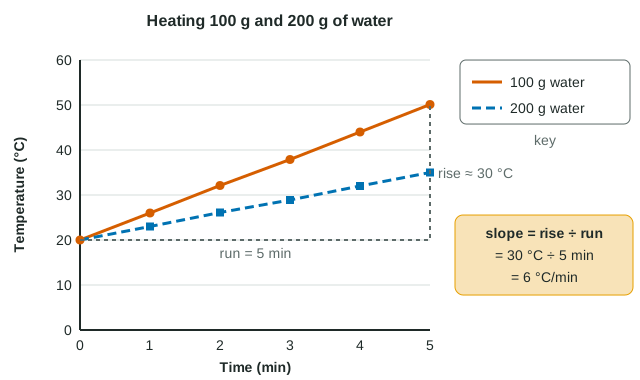
- You identify the independent variable (time) and the dependent variable (temperature).Time goes on the x-axis and temperature on the y-axis.
- Time is continuous: there are values between every pair of readings.A line graph fits; categories such as "enzyme A, B, C" would need a bar graph instead.
- Equal distances on an axis must stand for equal amounts.You choose an even scale (every 10 °C, every 1 min) that fills most of the grid and label each axis with its unit.
- Two groups are plotted on one set of axes.A key is needed so a reader knows which line is 100 g and which is 200 g.
- The points form a pattern you want to describe numerically.You draw a trend line and find its slope (rise ÷ run, here 6 °C/min) to compare how steeply the groups change.
Part 6 · Key ideas
Key ideas
- Worked example. 100 g of water: 20.0 °C at 0 min, 50.1 °C at 5 min. Slope = (50.1 − 20.0) ÷ (5 − 0) = 6.0 °C/min. The 200 g line rises 15 °C in 5 min: 3.0 °C/min, half as steep.
- Graph choice: line graph for a continuous independent variable, bar graph for categories, scatterplot for two measured variables, histogram for how one variable is distributed.
- Reading between points is interpolation (usually safe); reading beyond them is extrapolation (risky: water heated past 100 °C boils instead of getting hotter).
- A correlation shows two variables change together. It does not show that one causes the other; a controlled experiment tests that.
Part 7 · Misconception
A common mistake
The wrong idea: Each axis should be marked with the exact values you recorded.
What actually happens: Each axis needs an even scale, where equal distances mean equal amounts. Recorded values are plotted as points on that scale; marking them as the scale distorts the shape of the graph.
Part 8 · Check yourself
Check yourself
Exam-style questions. Anything you miss goes into your review queue.
Graph
Heating two masses of water
Students heated 100 g and 200 g of water, each starting at 20 °C, on identical hot plates set to the same power, and recorded the temperature every minute.
100 g water200 g water
Data table
| Time (min) | 100 g water | 200 g water |
|---|---|---|
| 0 | 20 | 20 |
| 1 | 26 | 23 |
| 2 | 32.1 | 26.1 |
| 3 | 37.9 | 28.9 |
| 4 | 44 | 32 |
| 5 | 50.1 | 35 |
1. Calculate the slope of the 100 g line between 0 and 5 minutes. Give your answer in °C per minute to one decimal place.
Type a number in °C/min.
Show the answer
Slope = change in y ÷ change in x = (50.1 − 20.0) °C ÷ (5 − 0) min = 30.1 ÷ 5 = 6.02, which rounds to 6.0 °C/min.
- Answer: 6.0 °C/min
2. Estimate the temperature of the 100 g sample at 2.5 minutes by reading between the measured points. Give your answer in °C to the nearest whole degree.
Type a number in °C.
Show the answer
This is interpolation. At 2 min the 100 g sample was 32.1 °C and at 3 min 37.9 °C; halfway between is (32.1 + 37.9) ÷ 2 = 35.0 °C.
- Answer: 35 °C
3. A student extends the 100 g line and predicts the water will be at 110 °C after 15 minutes. What is the best evaluation of this prediction?
- It is unreliable: it extrapolates far past the data, and at normal air pressure liquid water stops warming near 100 °C as heat goes into boiling.
- It is reliable, because the points lie on a straight line, and a straight line drawn through data continues at the same slope however far it is extended.
- It is unreliable, because the slope should be measured from the 200 g line, which is the larger and more representative sample.
- It is reliable, as long as the student uses the slope from the first minute alone, when the hot plate is coldest.
Show the answer
Extrapolation assumes the pattern continues outside the measured range. Here it cannot: once water reaches its boiling point, added heat breaks hydrogen bonds to turn liquid into vapor, and the temperature levels off near 100 °C.
- Correct: It is unreliable: it extrapolates far past the data, and at normal air pressure liquid water stops warming near 100 °C as heat goes into boiling.: Correct: extrapolation beyond the data, and a physical limit at the boiling point.
- It is reliable, because the points lie on a straight line, and a straight line drawn through data continues at the same slope however far it is extended.: Data only show the pattern over the measured range; nothing guarantees a line keeps going.
- It is unreliable, because the slope should be measured from the 200 g line, which is the larger and more representative sample.: The 200 g line has its own slope; it does not describe the 100 g sample.
- It is reliable, as long as the student uses the slope from the first minute alone, when the hot plate is coldest.: Picking one minute does not fix the problem of predicting far beyond the measured range.
4. The slope of the 200 g line is about half the slope of the 100 g line. Which explanation fits?
- Both hot plates supply heat at the same pace, and twice the mass of water needs twice the heat to rise by each degree.
- The 200 g water has a lower specific heat than the 100 g water, so each gram of it warms more slowly when the same heat is supplied.
- The 200 g water has fewer hydrogen bonds per gram, so less of the heat it receives is used to warm it up.
- The slope of a line depends on how many points are plotted, and both lines were given six points each.
Show the answer
Specific heat is per gram. With equal heat input per minute, doubling the mass halves the temperature rise per minute: 6 °C/min becomes about 3 °C/min.
- Correct: Both hot plates supply heat at the same pace, and twice the mass of water needs twice the heat to rise by each degree.: Correct: same heat in, twice the grams to warm.
- The 200 g water has a lower specific heat than the 100 g water, so each gram of it warms more slowly when the same heat is supplied.: Specific heat is a property of water per gram; it is the same in both beakers.
- The 200 g water has fewer hydrogen bonds per gram, so less of the heat it receives is used to warm it up.: Water has the same hydrogen bonding per gram whatever the amount.
- The slope of a line depends on how many points are plotted, and both lines were given six points each.: Slope depends on rise and run, not on the number of points.
5. A student measured how much monomer four different enzymes (A, B, C and D) each released from the same polymer in 10 minutes. Which graph type best displays the results?
- Bar graph, one bar per enzyme
- Line graph, joining the four enzymes in order
- Histogram of the four masses of monomer released
- Scatterplot of enzyme letter against mass released
Show the answer
The independent variable (enzyme type) is categorical: there is nothing "between" enzyme A and enzyme B. Separate bars compare categories.
- Correct: Bar graph, one bar per enzyme: Correct: categories become separate bars.
- Line graph, joining the four enzymes in order: A line implies values between the points, which do not exist for categories.
- Histogram of the four masses of monomer released: A histogram shows how often values fall in ranges of one variable; it does not compare named groups.
- Scatterplot of enzyme letter against mass released: A scatterplot needs two measured numbers; enzyme identity is a category, not a number.
6. Across 40 lakes, lakes with more plant growth along the shore also had warmer surface water. A student concludes that plant growth warms lakes. What is the best response?
- The data show a correlation; a third factor, such as more sunlight on shallow lakes, could raise both, so an experiment is needed.
- The conclusion is correct, because a strong positive correlation between two measured variables shows that the first variable causes the second one.
- The conclusion is backward: the data prove that warm water causes plant growth, since temperature is measured in °C.
- The data are useless, because a study of lakes has no independent variable and so it is unable to show a relationship of any kind.
Show the answer
A correlation means two variables change together. It does not show which (if either) causes the other; another factor can drive both. Testing causation needs a controlled experiment in which one factor is changed and others are held constant.
- Correct: The data show a correlation; a third factor, such as more sunlight on shallow lakes, could raise both, so an experiment is needed.: Correct: correlation, possible third factor, test with an experiment.
- The conclusion is correct, because a strong positive correlation between two measured variables shows that the first variable causes the second one.: Correlation does not establish causation.
- The conclusion is backward: the data prove that warm water causes plant growth, since temperature is measured in °C.: The data do not prove either direction; the units of a variable say nothing about cause.
- The data are useless, because a study of lakes has no independent variable and so it is unable to show a relationship of any kind.: Observational data can show a relationship (a correlation); they just cannot by themselves show cause.
7. A student's y-axis for temperature is marked 20, 25, 35, 40, 60 °C at equal spacing, one mark for each reading she took. What is wrong, and what does it do to the graph?
- The scale is uneven, so equal distances stand for different temperature changes and the shape of the curve is distorted.
- Nothing is wrong, because each recorded value appears on the axis, so a reader can find the exact temperature of each point.
- The scale should start at 0 °C; any axis that starts above zero is an error.
- The temperatures should be on the x-axis, because they are the numbers that were recorded.
Show the answer
Equal spacing must mean equal steps (for example every 10 °C). Here one gap is 5 °C and another 20 °C, so a steady warming would look bumpy and slopes cannot be compared.
- Correct: The scale is uneven, so equal distances stand for different temperature changes and the shape of the curve is distorted.: Correct: an uneven scale distorts the curve.
- Nothing is wrong, because each recorded value appears on the axis, so a reader can find the exact temperature of each point.: Showing the recorded values does not make up for a scale whose steps are unequal.
- The scale should start at 0 °C; any axis that starts above zero is an error.: An axis may start above zero if it is labeled clearly and the scale is even.
- The temperatures should be on the x-axis, because they are the numbers that were recorded.: Temperature is the measured response here, so it belongs on the y-axis.
Part 9 · Summary
Summary
Put the independent variable on the x-axis and the dependent variable on the y-axis, each labeled with units on an even scale. Choose a line graph for a continuous independent variable, a bar graph for categories, a scatterplot for two measured variables and a histogram for a distribution. Add a key for groups. The slope (rise ÷ run, with units) describes how steeply a line changes; interpolate with care and extrapolate rarely; and remember that correlation is not causation.
Part 10 · Up next
What comes next
Part 11 · Connections