Unit 5 practice test: Regression Analysis
12 exam-style questions from the unit, free, with an explanation for every option. Most have four answer choices, as on the real exam, and a few ask you to type a value, an interval or the setup; sets share one data set, plot or table.
Covers: Graphical Representations Between Two Quantitative Variables; Correlation; Linear Regression Models; Residuals; Least-Squares Regression.
Graph
Four scatterplots
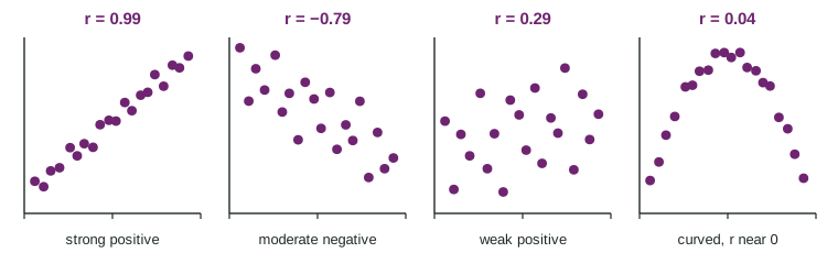
1. Which plot shows a strong relationship even though its correlation is close to 0?
- The strong positive plot,
- The weak positive plot,
- The moderate negative plot,
- The curved plot,
Show the answer
Correlation near 0 means no linear association; there may still be a strong curved one.
- The strong positive plot, : Its is close to 1, not 0.
- The weak positive plot, : Those points are widely scattered; the relationship really is weak.
- The moderate negative plot, : Its is far from 0.
- Correct: The curved plot, : Right: the points follow an arch very closely, but measures only linear association, and an arch is not a line.
2. Which plot has the strongest linear association?
- The plot with , because its points spread widest
- The plot with
- The plot with , because its pattern is clear
- The plot with , because negative is stronger
Show the answer
Linear strength is the size of , , whatever its sign.
- The plot with , because its points spread widest: Wide spread means a weak association.
- Correct: The plot with : Right: its is closest to 1 or in size, and its points hug a line.
- The plot with , because its pattern is clear: The curve is clear, but it is not linear, and measures linear strength.
- The plot with , because negative is stronger: The sign gives direction only. Compare sizes: 0.99 is larger than 0.79.
3. What does the plot with show?
- A weak association, because is negative
- That decreases by 0.79 for each unit of
- That 79% of the points lie on a line
- A moderate linear trend: tends to fall as rises
Show the answer
Sign: direction. Size: strength of the linear pattern.
- A weak association, because is negative: A negative is not weaker; is as strong as 0.79.
- That decreases by 0.79 for each unit of : That would be a slope; has no units.
- That 79% of the points lie on a line: is not a percent of points.
- Correct: A moderate linear trend: tends to fall as rises: Right: the negative sign gives the direction, and a size of 0.79 is a moderate linear association, close to strong.
4. A student says, "The curved plot has , so and are unrelated." What should you tell the student?
- The student is right: a correlation near 0 means no relationship of any kind
- The student should square to see the true strength
- The correlation was probably computed wrong
- Look at the plot first: misses curved relationships
Show the answer
Correlation describes linear relationships only.
- The student is right: a correlation near 0 means no relationship of any kind: A strong curve can have near 0, as this plot shows.
- The student should square to see the true strength: Squaring a small number makes it smaller and still ignores the curve.
- The correlation was probably computed wrong: It is correct; the arch is symmetric, so the upward and downward halves cancel in .
- Correct: Look at the plot first: misses curved relationships: Right: always plot the data; a near-zero rules out only a linear pattern.
Graph
Practice and free throws, with one unusual player
5. How is the player at 16 hours best described?
- A typical point, since it lies inside the range of values
- A point with a large residual that the line passes far from
- An outlier with no effect on the line, since its percentage is ordinary
- High leverage and influential: extreme , and it pulls the line
Show the answer
High leverage: an extreme value. Influential: removing it changes the line a lot.
- A typical point, since it lies inside the range of values: Its value, 16, is twice the next largest, which makes it unusual.
- A point with a large residual that the line passes far from: The line is pulled close to it, so its residual is not very large; that is what influence looks like.
- An outlier with no effect on the line, since its percentage is ordinary: Its 58% is ordinary on its own, but at 16 hours it is far from the others' values, so it moves the line a lot.
- Correct: High leverage and influential: extreme , and it pulls the line: Right: far from gives high leverage, and removing it changes the slope a lot.
6. With all 11 players the least-squares slope is about 0.49. What happens to the slope if the 16-hour player is removed?
- It becomes negative
- It decreases to about 0.24
- It stays about 0.49, since one point out of 11 is small
- It increases to about 2.92
Show the answer
Removing an influential point changes the slope substantially.
- It becomes negative: The other ten points rise steeply; the slope without the point is positive and large.
- It decreases to about 0.24: The unusual point is below where the trend of the others would put it, so removing it makes the line steeper, not flatter.
- It stays about 0.49, since one point out of 11 is small: A point with high leverage can change the slope a great deal, as here.
- Correct: It increases to about 2.92: Right: technology gives for the other ten players. The one point had flattened the line.
7. With all 11 players, . Without the 16-hour player, . What does this show?
- Practice has little to do with free throws for these players
- The 16-hour player should be deleted from any report
- One point hides a strong linear link among the other ten
- Correlation is resistant to unusual points
Show the answer
Unusual points can change and the slope; analyze with and without them.
- Practice has little to do with free throws for these players: Among the ten typical players the association is strong; the weak is caused by one point.
- The 16-hour player should be deleted from any report: Report the point and the analysis with and without it; do not delete data without a reason.
- Correct: One point hides a strong linear link among the other ten: Right: correlation is not resistant; one high-leverage point weakened it from 0.97 to 0.32.
- Correlation is resistant to unusual points: The change from 0.97 to 0.32 shows the opposite.
8. Which pair of variables could be shown on a scatterplot?
- Height and arm span of 25 students, both in centimeters
- Grade level and favorite subject of 25 students
- Heights of 25 students in one class and 30 students in another
- Favorite sport and eye color of 25 students
Show the answer
A scatterplot needs two quantitative variables on the same individuals.
- Correct: Height and arm span of 25 students, both in centimeters: Right: two quantitative variables measured on the same individuals.
- Grade level and favorite subject of 25 students: Favorite subject is categorical, so a scatterplot cannot show it.
- Heights of 25 students in one class and 30 students in another: A scatterplot pairs two variables on the same individuals. These are one variable for two groups.
- Favorite sport and eye color of 25 students: Both are categorical. A two-way table or segmented bar chart fits them.
9. For children aged 5 to 12, a line predicts height (cm) from age (years): . Why should the intercept not be interpreted as a newborn's height?
- Age 0 is outside the data, and growth is not linear from birth
- Intercepts are not meaningful in any regression line
- 76 cm is the average height of the children in the study
- The slope is positive, so the intercept should be ignored
Show the answer
Interpret the intercept only when makes sense in context.
- Correct: Age 0 is outside the data, and growth is not linear from birth: Right: interpreting the intercept here would be extrapolation; real newborns are about 50 cm.
- Intercepts are not meaningful in any regression line: An intercept is meaningful when is inside the data, as for new phones.
- 76 cm is the average height of the children in the study: The intercept is the prediction at age 0, not an average.
- The slope is positive, so the intercept should be ignored: The sign of the slope does not decide whether the intercept makes sense.
10. A residual plot shows residuals spread out more and more as increases, like a fan. What does this mean?
- The relationship is curved
- The correlation is exactly 0
- Predictions are less precise for large , since the scatter grows
- The line fits perfectly for large
Show the answer
Fan shape: spread of the residuals changes with .
- The relationship is curved: A curve shows up as a bend in the residuals. A fan shows growing spread.
- The correlation is exactly 0: A fan shape says nothing about being 0.
- Correct: Predictions are less precise for large , since the scatter grows: Right: the line's typical error changes with , so predictions for large are less reliable.
- The line fits perfectly for large : The residuals are largest there, so the fit is worst there.
11. Across cities, the number of fire trucks sent to a fire and the dollar damage have a correlation of 0.7. What explains this best?
- 70% of the damage is caused by the trucks
- Bigger fires bring more trucks and more damage
- The correlation is probably a mistake in the data
- The fire trucks themselves cause most of the damage
Show the answer
A strong correlation can come from a lurking variable.
- 70% of the damage is caused by the trucks: is not a percent of anything.
- Correct: Bigger fires bring more trucks and more damage: Right: fire size is a lurking variable linked to both. Correlation does not mean the trucks cause damage.
- The correlation is probably a mistake in the data: The correlation is real; its explanation is a lurking variable.
- The fire trucks themselves cause most of the damage: Correlation is not causation; a third variable explains both.
12. A scatterplot has correlation . What is true of the slope of its regression line?
- It is negative
- It is
- It is positive
- It is 0
Show the answer
Slope and correlation share their sign.
- Correct: It is negative: Right: the slope and the correlation always have the same sign.
- It is : The slope has units and depends on the spreads of and ; it equals only in special cases.
- It is positive: A negative correlation means tends to fall as rises, so the line falls.
- It is 0: A slope of 0 would mean no linear trend, but shows one.
Keep going
Practice has every question in the unit, with feedback after each one; the notes for every topic are free. Other units: Unit 1 · Unit 2 · Unit 3 · Unit 4 · Unit 5.